


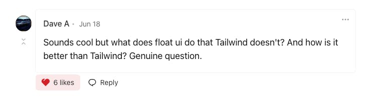
A few days ago, I wrote a blog post about Float UI, and someone commented on it as you can see in the image below, which means some people still don’t understand the difference between Float UI and Tailwind CSS, and in this article, I want to clarify some points.
To understand more let’s see what is Tailwind CSS, and what is Float UI, then we gonna learn how they work together.
What is Tailwind CSS
Tailwind CSS is a highly popular utility-first CSS framework that has been gaining significant attention and adoption among web developers. Unlike traditional CSS frameworks that come with predefined styles and components, Tailwind CSS takes a unique approach by providing a comprehensive set of utility classes that can be combined to build custom user interfaces.
At its core, Tailwind CSS focuses on offering a utility-first approach to styling. This means that instead of relying on pre-built components, developers can leverage a wide range of small, single-purpose utility classes to style their HTML elements. These utility classes can be applied directly in the HTML markup, allowing for a more flexible and modular approach to styling.
One of the key advantages of Tailwind CSS is its extensive set of utility classes. The framework provides a vast collection of utility classes that cover a wide range of styling properties such as margins, padding, typography, colors, and more. These classes follow a consistent naming convention, making it easy to understand and apply styles to elements. With Tailwind CSS, you can quickly and efficiently create custom designs without having to write custom CSS code from scratch.
Here are a few examples of Tailwind CSS utility classes in action:
<div class="container mx-auto">
  <!-- The 'container' class centers the content horizontally -->
  <!-- The 'mx-auto' class adds horizontal margin for centering -->
  <h1 class="text-3xl font-bold text-blue-500">Welcome to my website!</h1>
  <!-- The 'text-3xl' class sets the font size to 3xl (extra-large) -->
  <!-- The 'font-bold' class makes the text bold -->
  <!-- The 'text-blue-500' class sets the text color to a specific shade of blue -->
  <p class="mt-4">Tailwind CSS is awesome!</p>
  <!-- The 'mt-4' class adds margin-top of 4 units -->
</div>
Another notable feature of Tailwind CSS is its responsive design capabilities. The framework includes built-in responsive utility classes that enable developers to create responsive layouts without writing media queries manually. By applying responsive classes, you can easily control the appearance of elements across different screen sizes, making your website or application fully responsive and mobile-friendly.
What is Float UI
Float UI is a powerful UI library built on top of Tailwind CSS that empowers web developers to create visually stunning and responsive interfaces. With its extensive library of components, emphasis on responsiveness, customizable design options, and commitment to accessibility, Float UI offers a comprehensive solution for building captivating and inclusive web interfaces. By harnessing the capabilities of Float UI, developers can streamline their development process, achieve consistent designs, and deliver exceptional user experiences.
Float UI goes beyond its comprehensive library of UI components by offering a range of website templates that simplify the process of building responsive sites. With these templates, you can quickly create visually appealing websites that adapt seamlessly to different devices. The inclusion of important SEO elements further enhances your website's visibility in search engines.
Here is an example of Float UI component, a simple banner :
export default () => {
    return (
        <div className="bg-indigo-600">
            <div className="max-w-screen-xl mx-auto px-4 py-3 items-center justify-between text-white sm:flex md:px-8">
                <div className="flex gap-x-4">
                    <div className="w-10 h-10 flex-none rounded-lg bg-indigo-800 flex items-center justify-center">
                        <svg xmlns="<http://www.w3.org/2000/svg>" fill="none" viewBox="0 0 24 24" strokeWidth={1.5} stroke="currentColor" className="w-6 h-6">
                            <path strokeLinecap="round" strokeLinejoin="round" d="M9.813 15.904L9 18.75l-.813-2.846a4.5 4.5 0 00-3.09-3.09L2.25 12l2.846-.813a4.5 4.5 0 003.09-3.09L9 5.25l.813 2.846a4.5 4.5 0 003.09 3.09L15.75 12l-2.846.813a4.5 4.5 0 00-3.09 3.09zM18.259 8.715L18 9.75l-.259-1.035a3.375 3.375 0 00-2.455-2.456L14.25 6l1.036-.259a3.375 3.375 0 002.455-2.456L18 2.25l.259 1.035a3.375 3.375 0 002.456 2.456L21.75 6l-1.035.259a3.375 3.375 0 00-2.456 2.456zM16.894 20.567L16.5 21.75l-.394-1.183a2.25 2.25 0 00-1.423-1.423L13.5 18.75l1.183-.394a2.25 2.25 0 001.423-1.423l.394-1.183.394 1.183a2.25 2.25 0 001.423 1.423l1.183.394-1.183.394a2.25 2.25 0 00-1.423 1.423z" />
                        </svg>
                    </div>
                    <p className="py-2 font-medium">
                        We just launched a new version of our library.
                    </p>
                </div>
                <a href="javascript:void(0)" className="inline-block w-full mt-3 py-2 px-3 text-center text-indigo-600 font-medium bg-white duration-150 hover:bg-gray-100 active:bg-gray-200 rounded-lg sm:w-auto sm:mt-0 sm:text-sm">
                    Learn more
                </a>
            </div>
        </div>
    )
}
Tailwind CSS vs Float UI
Now we have more information about both of them Float UI and Tailwind CSS, so they work with each other, and to make Float UI works we need Tailwind CSS, because it’s built on top of it, and we can’t compare them in this case, it’s like when you try to compare JavaScript with Reactjs, and which one is the best.